Crypto Chart Patterns: How To Read Crypto Charts And Other Trading Patterns?
Key Insights
- Candlestick structure and classic patterns such as Hammer, Doji, Engulfing, Head and Shoulders, triangles and flags form the core toolkit for interpreting sentiment and spotting reversals or continuations.
- A top down workflow that starts on weekly or daily charts and drills into H4 H1 and M15 M5 aligns decisions with the dominant trend and reflects Dow Theory’s primary secondary and minor trend hierarchy.
- Probability improves when confluence from RSI MACD and volume is combined with strict risk management around one percent capital at risk per trade predefined stops and targets and swift execution via SimpleSwap fixed or floating swaps and alerts.-Candlestick charts are the most popular for traders today because they visually display important price action like the open, close, high and lowin an intuitive format. This makes interpreting sentiment and momentum easier.
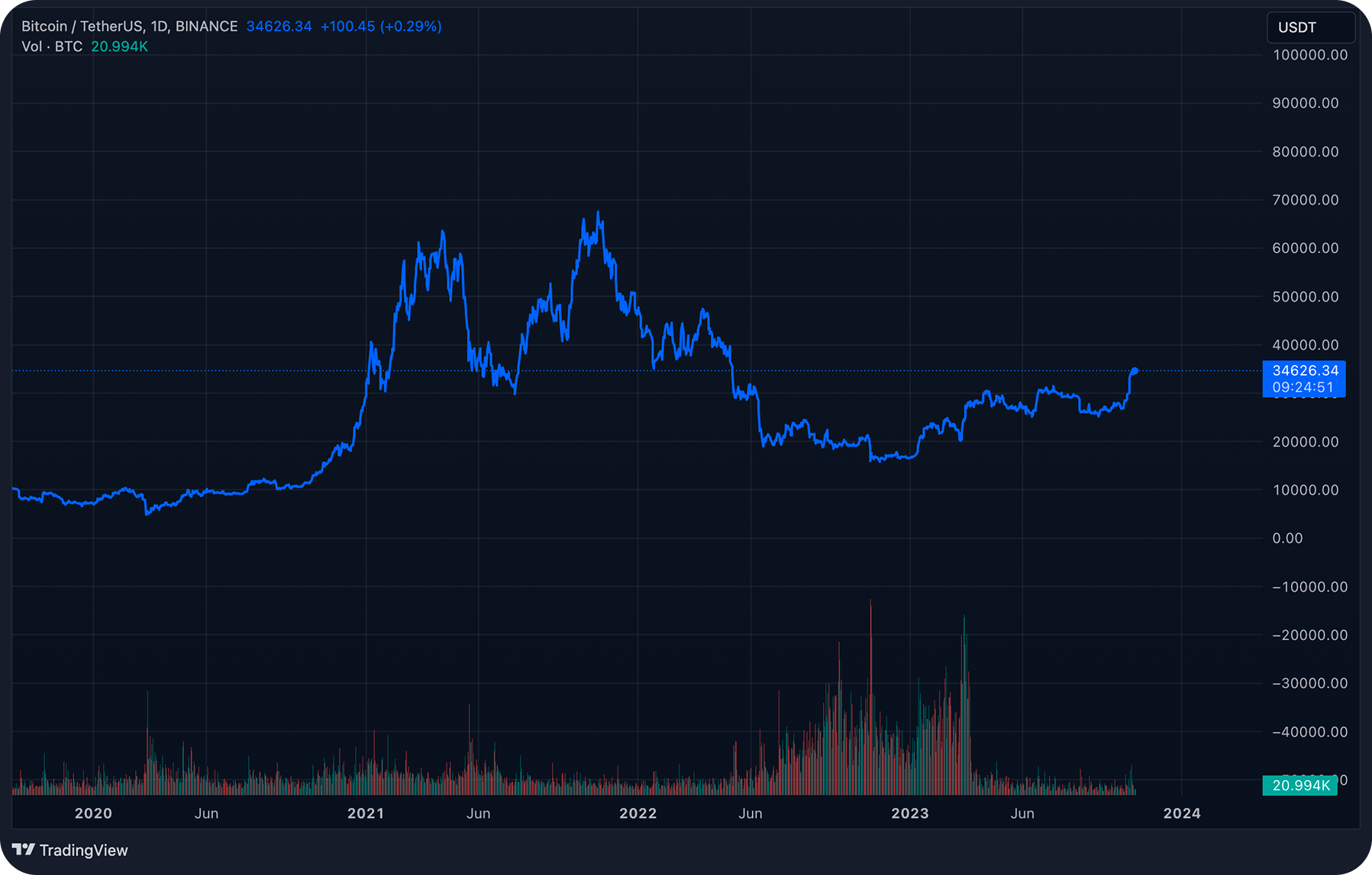
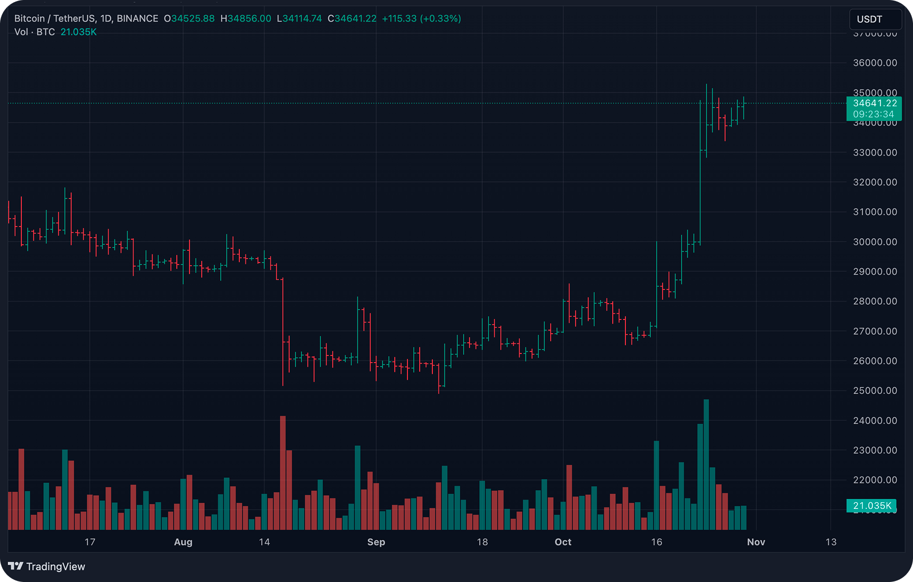
- Analyzing multiple timeframes of charting crypto, from long-term to short-term, provides critical context on the overall trend as well as potential entry and exit points.
Introduction
Reading crypto charts turns what often looks like random price swings into meaningful insight. It’s the technical analysis skill that transforms impulsive decisions into reasoned strategies. Once you get comfortable interpreting each candle, recognizing repeating patterns, and tracking sentiment shifts, you begin to grasp crowd psychology and probability-driven setups.
At the same time, SimpleSwap is positioned as your execution tool: when your crypto chart reading signals opportunity, SimpleSwap provides a sleek way to swap or buy BTC and thousands of other assets using crypto or fiat. That instant ability to act on insight is critical in fast-moving markets and might help you to make more informed trading decisions.
This information provided in this article does not constitute financial advice.
Types of Crypto Price Charts
Before jumping straight to getting to know how to read candlesticks, which is the most universally favored chart type, it’s useful to take a broader view of charting styles. Across most platforms, charts fall into three categories: line, bar (OHLC), and Japanese candlesticks. Each offers a different balance of simplicity and detail. Understanding chart types is a logical starting point to identify crypto patterns and learn how to read them.
Line Charts
A line chart connects consecutive closing prices over your chosen timeframe. It’s clean, minimal, and ideal for a quick overview of the trend. This simplicity makes it perfect for filtering noise and identifying the general market direction. However, it doesn’t show intraperiod highs, lows, or opening prices.
Bar Charts (OHLC)
For a richer snapshot without losing clarity, bar charts (OHLC) are a solid step up. Each vertical line of this crypto chart shows the range between the low and high, and small ticks mark the opening (left) and closing (right) prices. Compared with line charts, bars deliver depth (volatility, sentiment shifts, momentum), yet keep the display leaner than filled candlesticks. This makes them useful if you want more insight without overwhelming visuals.
Japanese Candlesticks
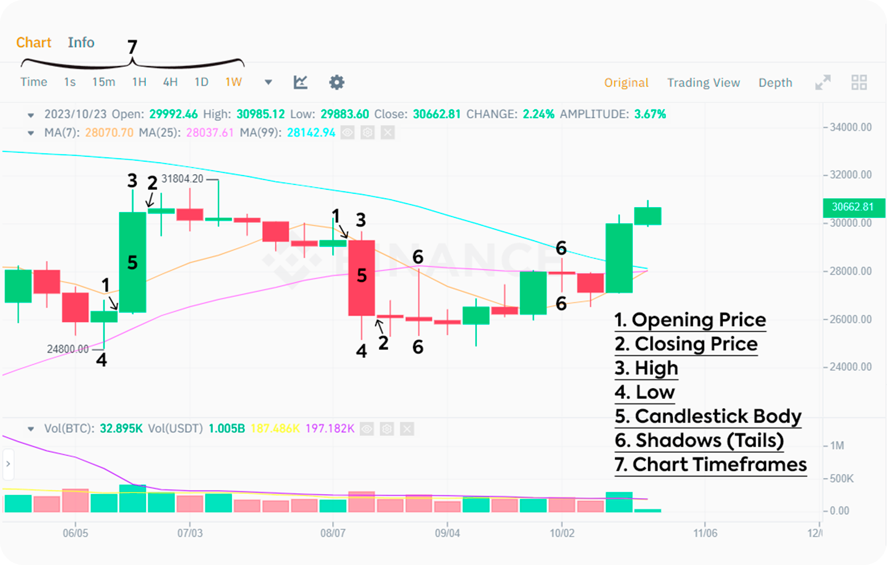
Candlestick charts use the same OHLC data but package it more intuitively. Here's how:
Body of the chart: the range between open and close.
Wicks (or shadows) on the chart show the high and low extremes reached.
Color of the chart: typically green (or white) when close > open, red (or black) when close < open.
Candles dominate crypto trading patterns for good reason. They make it easy to spot whether buyers or sellers held control, and how strong that control was. For instance, a long lower wick often points to intense selling that was absorbed by buyers – valuable visual information at a glance.
Candlestick Charts: Structure and Interpretation
Building on our understanding of crypto chart types, this type of patterns deserves special attention and not just for what they look like, but for the story each one tells. Think of a single candle as a duel between buyers and sellers to shape price action.
Components and the Information They Convey
Every candle represents four essential data points:
Open: the first trade of the period
Close: the final trade before the period ends
High and Low: the extremes reached during that span
Body: the bar between open and close, its size shows who had more control
Wicks (Shadows): those thin lines above and below the body capture intraperiod attempts to move price beyond the open or close
Here’s what to watch for:
A large body signals strong conviction: either aggressive buying or selling pressure.
A long lower wick typically suggests buyers absorbed initial selling pressure and paved the way higher.
Conversely, a long upper wick warns that bulls attempted to push prices up but ultimately lost to selling forces.
These visual cues offer critical insight into market sentiment and order-flow dynamics.
Interpreting Bullish and Bearish Candles
Candles come in two basic colors:
Bullish (often green or white): indicates a close higher than the open
Bearish (commonly red or black): indicates a close below the open.
Blade alone might tell part of the story, but shape completes it. Consider:
A small green body with a very long lower wick – a classic Hammer setup. It signals that although sellers dominated early, buyers pushed back hard before the period closes.
On the flip side, a small red body capped by a long upper wick – the dreaded Shooting Star – suggests that buyers tried to chase higher prices, but sellers countered decisively.
Importantly, the relative lengths of bodies and wicks of matter. A short body nestled near the top with a sizeable lower wick (the Hammer) is often more telling than a medium-bodied candle with barely any wicks. That one long wick shows strong intraperiod sentiment shift and potential inflection.
Timeframes: From Micro Noise to Macro Structure
Choosing the right timeframe is at the heart of crypto chart reading and technical analysis. Larger timeframes give us solid, statistically reliable signals, while smaller ones offer precision but bring more market “noise.”
Minute charts (M1, M5, M15, M30) are the domain of scalpers and ultra-active day traders. These charts help you execute precise entries and exits, but expect a lot of erratic movements.
Hourly charts (H1, H4) are favored by swing traders – those who aim to capture moves unfolding over hours or days.
Daily (D1) and Weekly (W1) frames are best for spotting the main trend and key support/resistance areas. Most veterans start here before zooming in for tactical timing.
A Practical Multi-Timeframe Workflow
To trade with clarity, consider layering your charts:
Identify the dominant trend on the weekly or daily chart, this will be your macro backdrop.
Drill down to the 4‑hour or 1‑hour chart to map intermediate structures, such as patterns or trend lines.
Use the 15‑minute (or even 5‑minute) chart when you need a sharp entry or exit point.
Why does this work? Because a top-down approach keeps you aligned with the broader trend, avoiding the trap of second-guessing a signal that contradicts the bigger picture. This multi-timeframe method is endorsed by leading trading guides and helps reduce false moves tied to short-term volatility.
Dow Theory: Core Principles and Their Application to Crypto
Dow Theory may date back to the late 1800s, but its insights into market trends and psychology still resonate, especially in crypto, where crowd sentiment and volatility reign.
The Market Discounts Everything
At its foundation, Dow Theory holds that all available information, such as macroeconomic data, on-chain metrics, macro news, is already reflected in price. As new factors emerge, prices shift accordingly.
History Rhymes
Traders repeat cycles. Fear, greed, euphoria, and capitulation manifest again and again. Bitcoin’s reactions to global events (from liquidity crises to central bank rate changes) echo past patterns and ought to be recognized during a technical analysis.
Trends Persist Until Reversal
A trend defined by successive higher highs and higher lows (uptrend), or lower highs and lower lows (downtrend) usually continues until a decisive reversal occurs, often confirmed by volume changes.
Three Degrees of Trend Coexist
Primary (global): lasts months to years
Secondary (medium): lasts weeks to months, often countertrend
Minor (short-term): lasts days to hours, which is mostly noise, but tradeable
These levels can play out simultaneously. It’s not unusual to see a bullish primary trend, a bearish secondary pullback, and a small bullish minor move all unfolding concurrently.
Three Phases of Primary Trends
Dow identified three distinct stages within a primary trend:
Accumulation: Informed traders accumulate during pessimistic periods.
2. Public Participation (Markup): The wider market recognizes the trend; volume and momentum build.

3. Distribution: Professionals sell into the euphoria as topping structures form.
Each phase reflects the transition from informed capital to herd behavior, a cycle clearly visible in maturing crypto bull runs.
Trend Identification and Phases in Practice
Now that we’ve covered timeframes and Dow Theory, let’s bring it into real-world crypto chart work. This section shows how to spot trends and recognize their stages.
Recognising Trend Direction
Uptrend: A sequence of higher highs and higher lows. This pattern reflects sustained bullish momentum.
Downtrend: Features lower highs and lower lows, a clear sign of bearish control.
Sideways/Range: Price moves back and forth within a horizontal band, bounded by relatively flat support and resistance levels.
Tools for Identifying and Validating Trends
Key tools and concepts include:
Swing Structure: Monitor successive peaks and troughs to track the prevailing bias.
Trendlines: Draw lines connecting higher lows (in uptrends) or lower highs (in downtrends). The more times price touches the line, the more significant it becomes.
Volume: A rising trend paired with increasing volume reinforces direction; decreasing volume in a range often precedes breakouts.
Phases Across Timeframes
It’s essential to recognize that trends operate on multiple levels simultaneously. You might see:
A bullish primary trend on the weekly chart
A bearish secondary pullback on the daily
A sideways minor drift on the 1-hour
Understanding trading patterns is crucial – it helps avoid mistakes like shorting a bull market during a small dip or buying every pullback in an overall downtrend.
Candlestick Patterns: Key Signals for Beginners
With trend structure clear, let’s focus on candlestick patterns – simple visual cues that can highlight market turning points, especially for newcomers.
Doji: When open ≈ close, it signals indecision. The next candle or a decisive break often validates its significance.
Hammer / Inverted Hammer: A small body with a long lower (hammer) or upper (inverted) wick. They’re typically bullish reversal patterns if formed after a decline – and more reliable when followed by confirmation.
Engulfing: A two-candle formation where the second candle completely “engulfs” the first. Bullish or bearish depending on direction, and best used near important support/resistance.
Shooting Star / Hanging Man: Mirror images, both have long upper wicks. The Hanging Man appears at the top of uptrends (bearish), while the Shooting Star is a one-candle bearish reversal signal.
Confirmation is everything. A bullish Engulfing candle at daily support, aligned with an uptrend and favorable RSI/MACD, carries far greater weight.
Core Chart Patterns and Their Implications
Beyond single-candle signals, multi-bar chart patterns tell broader stories about supply, demand, and crowd actions.
Head and Shoulders / Inverse Head and Shoulders
Head and Shoulders chart pattern: Three peaks, with the middle (“head”) highest. A break of the neckline often signals a reversal from uptrend to downtrend.
Inverse Head and Shoulders: The same structure upside-down. A break below the neckline flags the end of a downtrend.
After rallying to the head and failing to break higher on the right shoulder, attention turns to downside risk.
Double Top / Double Bottom
Double Top: Two failed attempts at resistance followed by a breakdown below the trough between them – now you can read a bearish signal.
Double Bottom: Two failed touches of support followed by a breakout above the intervening peak – a bullish reversal.
This simple yet powerful structure is widely studied and traded.
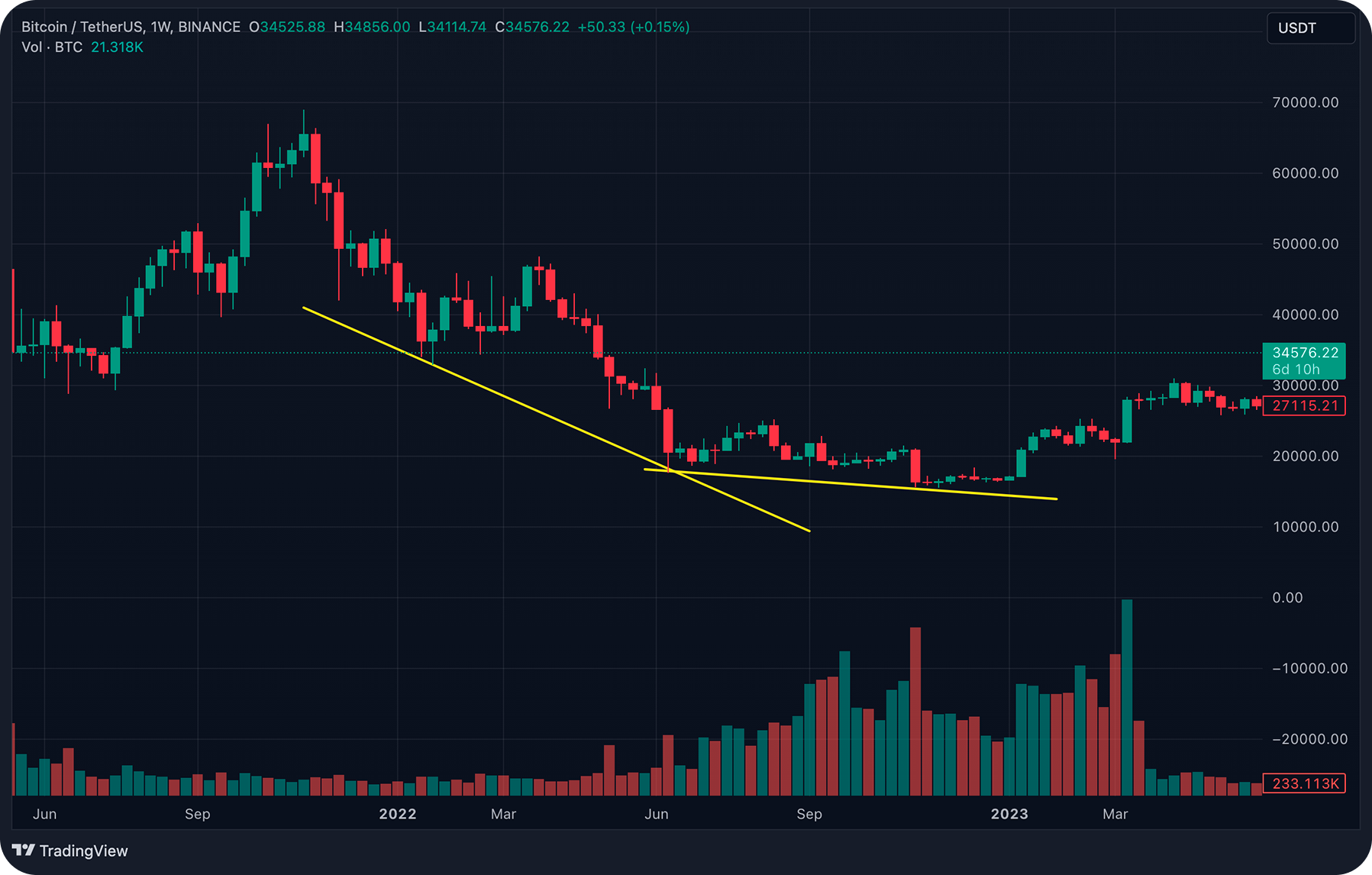
Ascending / Descending Triangles
Ascending Triangle: Flat resistance meets rising lows – buyers grow aggressive. Often breaks upward.
Descending Triangle: Flat support meets falling highs – sellers tighten the range. Usually resolves downward.
These patterns reflect energy building to break in the direction of the dominant momentum.
Flags, Pennants, and Rectangles
These smaller formations – flags and pennants in particular – are hallmarks of continuation patterns. Price rallies, pauses briefly (forming the flag or pennant), then resumes the prior trend, ideally with volume expansion.
Integrating Patterns for Higher‑Probability Setups
Great trades rarely hinge on a single indicator. Rather, they’re built from layers of confirmation – a concept traders often call confluence. When multiple independent signals align, odds swing in your favor. Here’s a cohesive example:
A Hammer candle appears at the second trough of a Double Bottom pattern – a classic reversal signal.
Simultaneously, RSI climbs back above 30, moving out of oversold territory.
MACD line crosses above its signal, signaling upward momentum.
The higher‑timeframe trend remains bullish – so you're trading with the broader current, not against it.
By aligning candle signals (micro), chart formations (macro), and momentum indicators, you're stacking probabilities – rather than gambling on a single data point.
Risk Management and Indicator Confirmation
Even the most promising setup can fail. Experienced traders stay in the game because they protect capital through sound risk management and intelligent confirmation techniques.
Position Sizing and the 1 % Rule
A basic yet powerful rule: never risk more than 1 % of your total account on a single trade. That’s not investing just 1 %, but risking 1 %. Consider this to make informed trading decisions. Calculate your position size by:
Identifying stop-loss placement
Determining the distance between entry and stop
Ensuring that max loss doesn’t exceed 1 % of your capital
This disciplined sizing preserves your ability to recover from a string of losses. Here understanding crypto chart patterns, learning to read them, apply this knowledge for different trading techniques, might come in handy.
Stop‑Loss and Take‑Profit Placement
Stop‑Loss: Position it just beyond the “invalid level”. For instance, a few ticks below the second low in a Double Bottom pattern.
Take‑Profit: Use the measured move technique – project the pattern height from entry. Then manage the remainder via a trailing stop, tied to a moving average or structure.
This ensures defined risk and objectives before you even trade.
Indicator Confirmation
RSI: Look for readings outside the 30–70 range or divergence – where RSI and price move in opposite directions.
MACD: Monitor for MACD line / signal line crossovers and histogram shifts.
When RSI and MACD agree on a signal, your trade idea gains a second layer of confirmation, reducing false entries and reinforcing conviction.
Platform Considerations
On SimpleSwap, you can choose between fixed-rate swaps to minimize slippage risk during volatile breakouts, or floating-rate for better rates if slippage isn't a concern. Alerts can notify you as price approaches key levels – while supporting both crypto-crypto and fiat-crypto pairs, so your decision turns into action seamlessly.
Selecting Appropriate Chart Timeframes
Choosing the right chart depends on your trading style, daily schedule, and emotional bandwidth:
Scalping / Day trading: Use minute charts (M1–M15) to find precise entries; define the local trend on H1.
Swing trading: Identify structure on H4/D1 and fine-tune your entry with H1/M15 charts.
Position trading / Investing: Your life is D1/W1 territory – less noise, more big-picture perspective.
Always start top-down. Let the higher timeframe tell you if you’re moving with or against the dominant flow – then zoom in to refine your entry and exit points with lower timeframes.
Illustrative Trading Frameworks (Not Financial Advice)
Below are structured, step-by-step examples of practical trade setups. These frameworks preserve the meaning of the original version while using precise wording and clear stage definitions. Adjust any parameters to suit your risk tolerance.
Double Bottom Reversal Framework
Context: A prolonged decline that stalls at a defined horizontal support range.
Signal: A bullish reversal candle – like a Hammer or Bullish Engulfing – forms at the second low.
Confirmation: Price closes above the “neckline” on rising volume, supported by bullish MACD and RSI behavior.
Entry: Initiate on the breakout above the neckline or on a safe retest of that breakout level.
Stop-Loss: Set just beneath the second trough to limit downside.
Targets:
T1: Measure the distance from trough to neckline and project upward.
T2: Manage the remainder with a trailing stop, such as the 21‑EMA or until RSI enters overbought (>70).
This method is a cornerstone of technical trading, blending price structure with momentum and volume confirmation for precision and discipline.
Ascending Triangle Continuation Framework
Context: The market is in a higher-timeframe uptrend, compressing into a rising-lows pattern below flat resistance.
Signal: The higher lows converging against a horizontal ceiling signal buyer accumulation.
Confirmation: A breakout candle clears resistance with a noticeable volume surge.
Entry: On the breakout candle close, or on a retest of the breakout level.
Stop-Loss: Below the most recent higher low or the trendline of the triangle.
Targets: Project the triangle’s height above the breakout level; monitor for volume fade or structure breaks to trail the rest.
Combines the comfort of trend-aligned continuation with clear risk parameters, which is ideal for momentum traders.
Head and Shoulders Distribution Framework (Short Bias)
Context: A mature uptrend starts to show exhaustion – often signaled by RSI divergence.
Signal: The right shoulder fails below the level of the head.
Confirmation: Price drops below the neckline with increasing volume.
Entry: On the decisive breakdown or following a conservative pullback to the neckline.
Stop-Loss: Just above the right shoulder peak.
Targets: Measure the distance from head to neckline and project downward; trail the remaining position according to structure break or a short-term moving average.
This framework blends pattern recognition with technical discipline to trade a controlled reversal.
SimpleSwap’s Perspective on Chart Analysis
SimpleSwap emphasizes empowering traders, not advising. Technical understanding helps reduce emotion-driven decisions, and SimpleSwap offers tools to act with discipline:
Wide asset availability: Over 1,500 crypto assets, letting you apply chart-based strategies to many markets.
Fixed-rate swaps: Lock in execution value ahead of time, avoiding slippage during quick breakouts.
Floating rates: Enjoy market movements if you're comfortable with slight variance in final outcome.
Alerts & educational tools: Stay informed on key levels and build technical competence with guides and primers.
In essence, charts explain "what" is happening in the market, SimpleSwap facilitates the "how" of execution.
Conclusion
Candlestick formations, chart patterns, trend frameworks, and Dow Theory aren’t sorcery, they’re structured frameworks for interpreting collective human behavior: fear, greed, exuberance, and regret.
When layered with solid risk protocols, multi-timeframe discipline, and savvy execution, you transform probability in your favor for a potentially successful trading. This is not a guarantee yet a way to enhance your trading strategy.
Keep refining your technique: journal trades, analyze winners and losers, and continually adapt. When you’re prepared to act, SimpleSwap’s seamless swap tools, across crypto and fiat, stand ready to help you implement insight, not improvise.

BTC and other cryptocurrencies can be purchased on SimpleSwap for crypto or fiat.
The information in this article is not a piece of financial advice or any other advice of any kind. The reader should be aware of the risks involved in trading cryptocurrencies and make their own informed decisions. SimpleSwap is not responsible for any losses incurred due to such risks. For details, please see our Terms of Service.


